
To configure the Links component, first click on the Component Menu ( ) the select Setup.
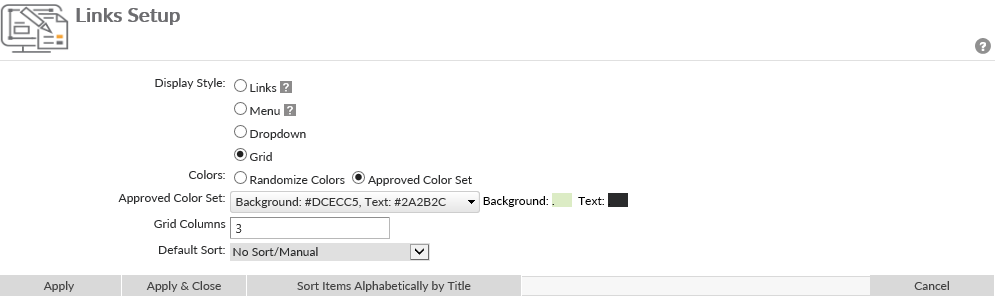
On the setup page choose from 4 different Display Style:
- Links – Links will be displayed in a list with bold text for links.
![]()
- Menu – Will mimic the vertical menu styles

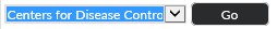
- Dropdown – Links will be contained in a drop down list. To open link, the user will select the link from the drop down and select the button. If selected, determine the following settings:
- ‘Go’ Button Caption – determine what the name of the button that users will click on to access the link.
- ‘Go’ Button Width – Select dynamic if you want the button to stretch with the size of the caption. If fixed is selected, enter the width in pixels of the button.
![]()
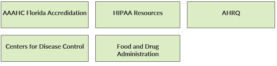
- Grid – Will display links in a grid of colored squares, or buttons. If selected choose to randomize the color of the buttons, or display from the Approved Color Set determined by an Administrator.
![]()
“Default Sort” can be set to Ascending or Descending, alphabetically by link.
Alternatively, if the Sort Items Alphabetically by Title button is clicked, the link order will sort alphabetically on the titles/labels given to the links as opposed to alphabetically by link.
Last modified:
Jul 10, 2023
Post your comment on this topic.